As dusk settles, your yard starts telling a different story. Wood darkens to honey, stone takes on depth, leaves turn velvety, and the places you cross every evening—the steps, the gate, the path to the dock—ask for just enough light to feel easy and inviting. The best outdoor lighting gets the color exactly right, so materials look like themselves, shapes light quietly without glare. That’s what “warm, accurate, comfortable” looks like in practice—choosing a color that suits the space, a beam that lands where it should, and a few simple details that make nights feel calm.
So, start thinking about your own routes and favorite corners, then match those moments to practical choices. When you’re ready to shop, SunTino’s solar lineup lets you put those choices to work—path markers, wall and step lights, adjustable spots and floods, and waterfront fixtures.
CCT by Zone: Set the Mood With the Right Color
Before you think about brightness, get color right. CCT—correlated color temperature—describes whether light looks warm (more candlelight) or cool (more daylight). It’s measured in Kelvin (K). Lower numbers are warmer; higher numbers are cooler. Outside, color changes how stone reads, how wood feels, and whether your plantings look rich or washed out. It also changes how comfortable your lighting feels at night, both to you and to neighbors and wildlife. The simplest path is to match color to how a space is used.
Warm is your default for living and strolling; neutral is for tasks and reading numbers; ultra-warm or amber helps at the edges—where wildlife and neighbor sightlines make comfort and low impact the priority.
2700K in the landscape: gentle, garden-friendly warmth
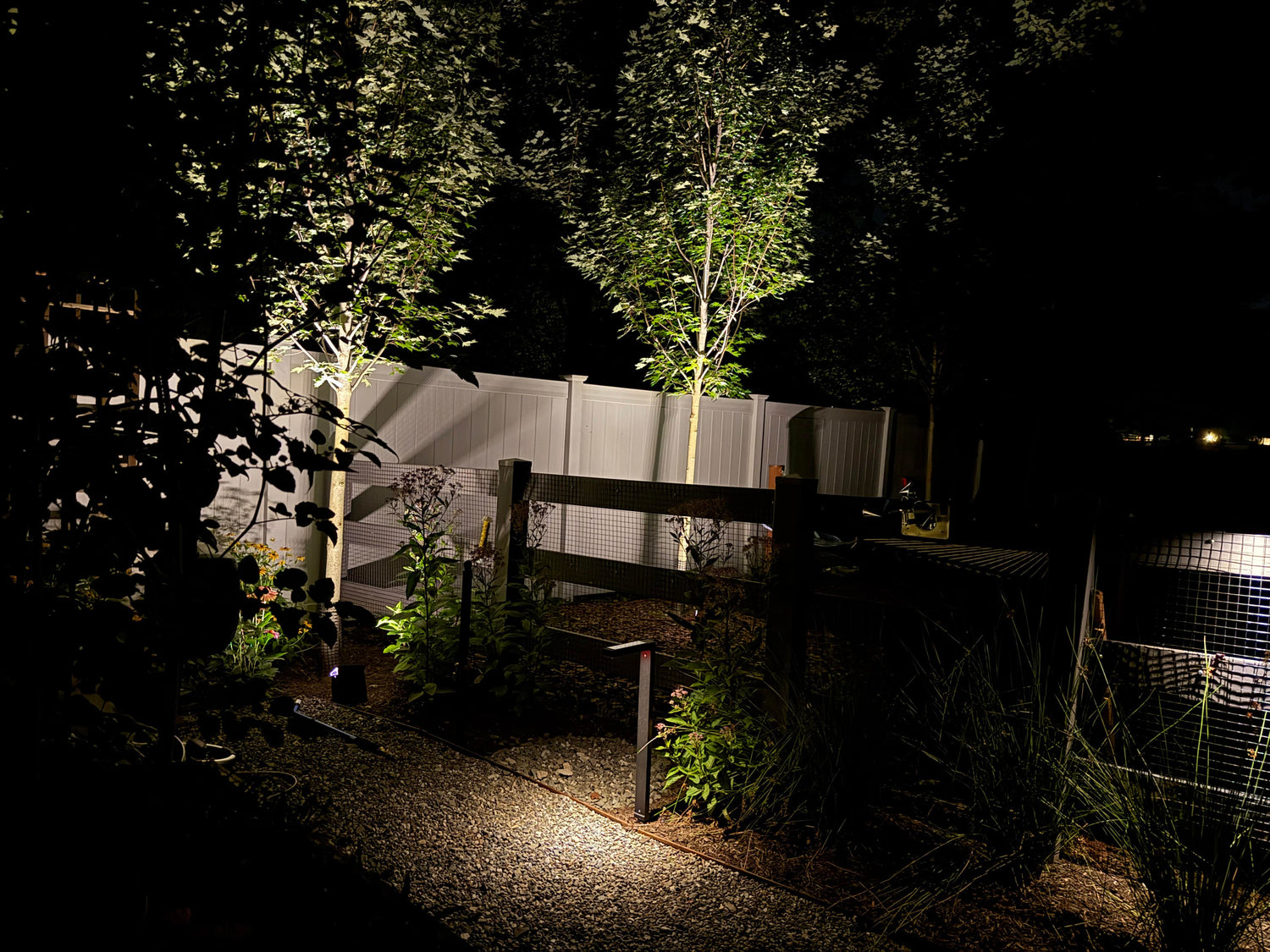
For lawns, garden beds, trees, and seating areas, 2700K is the sweet spot. It’s warm enough to make bark and mulch look rich, flowers look saturated, and faces feel comfortable. If you’re marking paths with low-glare markers (think SunTino’s path and garden product families), 2700K keeps a soft, candle-like vibe that makes you want to linger. This is also the safest choice to pair with natural materials; it hides small imperfections and reduces harsh contrast on textured stone.
3000K on hardscape and task zones: clean, useful, readable
For drive aprons, steps, house numbers, grills, and garage entries, 3000K lands a touch cleaner without feeling clinical. It helps edges and risers read clearly and can make engraved address stones more legible. Use it when you want just a bit more crisp light to find keys, read labels, or check steps. Wall lights at the entry, step markers on stairs, or a modest flood on a work surface all benefit here. If you’re browsing SunTino’s wall and step options, look for selectable color or a 3000K variant for these tasks.
≤2200K/amber near wildlife and neighbor-sensitive edges: calm, low-impact light
Along shorelines, tree lines, property edges facing bedrooms, and anywhere you want the lowest night impact, go ultra-warm (≤2200K) or amber where possible. This keeps light gentler to eyes and reduces the chance you’ll create “hot spots” that draw insects or irritate neighbors. On docks and along waterfront walks, warm/amber light with tight optics is your friend. SunTino’s waterfront families (dock, boatlift, shoreline markers) are built for this—aim them down and keep the beam on surfaces, not out across the water.
If a product doesn’t list exact CCT, compare photos of the lit examples and scan reviews for “warm vs. cool” comments. And if you’re mixing families (paths, walls, docks), choose either 2700K or 3000K as the “house color” so the whole property reads consistent after dark.
CRI 90+: When Color Rendering Matters (and When CRI 80 Falls Short)
CCT sets the mood; CRI (Color Rendering Index) tells you how true colors look under that light. It’s scored from 0 to 100. A higher number means materials—wood, stone, plants, fabrics, skin—look closer to how they appear in daylight. Many outdoor fixtures sit around CRI 80, which is fine for basic wayfinding. But there are moments when CRI 90+ is worth it, and you’ll see the difference the first night you turn it on.
Where CRI 90+ earns its keep
Use high-CRI light where materials and people matter most—entries, decks, stonework, and hero plants—so colors read true instead of muddy at night.
- Wood decks and cedar fencing. With CRI 90+, the warmth and grain of cedar, ipe, or redwood come through instead of going muddy. Decks feel expensive rather than flat. If your outdoor space revolves around a deck, step up the rendering where it counts—on the surfaces people notice.
- Stonework and mixed hardscape. Bluestone, limestone, and modern pavers have subtle tints. CRI 80 can push those toward gray-beige. CRI 90+ keeps the “real” color and texture, so a grazing light across a wall or riser looks deliberate and rich rather than chalky.
- Plant palettes. Greens aren’t all the same. High-CRI light helps leaves and blooms keep their hue, especially reds and purples that otherwise go dull. Uplighting a Japanese maple? High CRI keeps the leaf color honest and the canopy dimensional.
- Front entries and people. Skin tones look better at CRI 90+. You’ll notice it when you glance at the doorbell camera or greet guests. It’s a small upgrade with a big “this feels right” effect.
When CRI 80 is enough
If the job is simply wayfinding—a path marker every 6–8 feet—and you’re already using 2700K or 3000K, CRI 80 can be perfectly fine. The ground plane doesn’t need gallery-grade accuracy. Save your high-CRI picks for focal areas and face-to-face spaces.
A quick at-home test
If you want a preview, take a fresh basil leaf and a natural-stain wood sample (or a cedar shingle) into your yard at night. Hold them under your current lights and note the color. Then try the same under a known high-CRI light source (even a high-quality indoor lamp brought temporarily outside). That “pop” you see is what CRI 90+ does for your materials. When browsing SunTino’s lines, if a fixture highlights “enhanced color” or a high-CRI LED engine for wall washers or floods, use it where materials matter.
High CRI can sometimes trade a bit of efficacy (lumens per watt). Balance that by leaning harder on optics and aiming, so you don’t need brute-force brightness to get the look you want.
Optics Over Lumens: Aim and Shape Beat Raw Output
It’s tempting to shop by lumens. More lumens must be better, right? Not outside. Optics—how a fixture shapes and directs light—decide whether 150 lumens looks perfect or wasted. A tight, well-aimed beam will beat a sloppy flood at twice the output every time. Understanding a few beam basics will help you buy with confidence.
The basics of beam angles
You can easily categorize beams as narrow, medium, or wide:
- Narrow (about 10–25°) is a spotlight. It reaches farther and creates drama on trees, columns, sculptures, and house numbers.
- Medium (about 25–45°) is your versatile beam for small trees, facade accents, and general feature lighting.
- Wide (about 45–120°) is a flood. It fills a deck or drive apron and smooths out large areas.
If you’re highlighting a 12–15 ft ornamental tree, a medium beam placed 2–3 ft out from the trunk usually paints the canopy without hot spots. For a tall, narrow column, go narrow; for a broad wall, go wide and graze from below or above.
Try asymmetric “path” optics
Path markers with asymmetric optics push a butterfly-shaped pattern along the path rather than equally in all directions. This means fewer fixtures and less spill into planting beds or eyes. When you look at product images or diagrams, you want an elongated “peanut” pattern that hugs the walking line. Many SunTino path families are designed with this in mind—keep an eye out for language like “forward throw,” “path optic,” or diagrams showing a longer oval.
How to read a beam chart
Manufacturers sometimes show a chart with three pieces of data: beam angle, center intensity, and a distance-to-spread relationship.
- The beam angle tells you narrow/medium/wide.
- Center intensity (often in candela) tells you how strong the brightest part is—useful when comparing spotlights.
- Distance vs. spread lets you estimate how wide the beam will be at a given distance.
Rule of thumb: For medium beams, the beam diameter is roughly 0.4–0.5× the distance. So at 10 ft, expect ~4–5 ft of lit width; at 20 ft, ~8–10 ft. If the object you’re lighting is wider than that, you need a wider beam or a second fixture.
Why this approach to outdoor lighting beats chasing lumens
A well-aimed 200-lumen spot with the right beam looks crisp and intentional. A 600-lumen flood that washes everything looks flat and can create glare. With solar, optics give you a double win: better visuals and better runtime, because you’re not wasting light where it isn’t needed. SunTino’s adjustable floods and spots let you dial in beams and aim—look for adjustable heads and spec notes on distribution.
We recommend trying this simple step: Use your phone flashlight from 15–20 ft away. Cup your hand around it to make a narrow “spot” and see how far it reaches and how dramatic it looks on a tree trunk or column. Then uncup your hand to mimic a flood. You’ll immediately see the difference optics make.
Glare Control: Keep Light Out of Eyes and Windows
Glare is the fastest way to make a good lighting plan feel bad. If you’ve ever looked across your yard and seen a bright dot rather than the thing you wanted to light, you’ve met glare. The fix isn’t always “turn it down.” It’s often shield, shape, and aim so the useful light goes where you need it, and the source stays out of sight.
Simple physical controls that make a big difference
Small add-ons like baffles, louvers, and visors quietly hide the light source and steer beams, cutting glare without sacrificing brightness.
- Baffles and louvers sit in front of the LED and hide the source from view. Think of them like eyelids for a fixture. Great for path markers near seating, where eyes are low.
- Visors and cowls wrap around the top or sides of a spotlight or flood, blocking stray light from hitting windows or a neighbor’s fence. If you’re placing a flood near the drive or garage, a visor aimed just under the sightline can eliminate oncoming glare.
- Cutoff shades ensure the beam points down, not out. For wall lights, look for designs where you can’t see the LED at standing height. If you can see the raw source, you’ll likely get glare.
- SunTino’s path markers, wall lights, and waterfront post mounts favor downlight and shielded optics. When you shop, scan for images that show a glow on the ground rather than a glowing lens.
Aiming tricks that keep things comfortable
A few inches of tilt or a slight shift in direction can turn harsh hotspots into soft, usable light that lands on surfaces—not in eyes or windows.
- Aim across, not at. Instead of pointing a flood straight at where you stand, aim across the surface. For a driveway, aim from one side toward the far edge; for stairs, aim along the steps so light grazes the nosings.
- Lower and closer. Mounting lower and closer to the surface gives you softer light and avoids broadcasting into the distance. A step light at riser height beats a bright flood from 12 ft up.
- Backlight with intent. To silhouette a plant or sculpture, put a small light behind it and aim toward a wall or hedge. You’ll see the shape without seeing the source.
- Cross-light trees carefully. Two lower-output spots from opposite sides can give depth without one harsh hot spot. Keep both fixtures outside the main viewpoint so you never look into a source.
Quick night checks
Once you place a light (even temporarily), walk the perimeter of your property after dark—driveway, sidewalk, neighbor-facing edges. If a fixture looks bright from any common viewpoint, adjust the aim or add a visor. Use your phone camera as a glare detector; if the source blows out into a big starburst on your screen, your eyes will feel it too. A tiny aim tweak often solves it.
Good glare control lets you run at lower brightness, which preserves battery. Pair it with motion-boost modes at entries and gates—most of the night you keep a gentle base level, and you get brightness only when someone is there.
Signature Effects Without Skyglow
This is the part everyone loves: the effects that make a yard feel designed. The key is to get the look without lighting the sky or the lake. That means beams below horizontal, targeted washes, and restraint—one or two effects per scene usually beats five.
Careful grazing: texture that feels high-end
Grazing means placing a light close to a surface and aiming almost parallel to it so texture jumps. On stone walls, the shadows from small ridges reveal craftsmanship. On wood, a gentle graze shows grain without glare. Use medium to wide beams and keep the source hidden by a capstone, coping, or plant mass. SunTino’s wall and step lights make this easy—mount low and let the optic do the work. Generally, if a wall is uneven, a second, lower-lumen graze from the other end can even out dark patches without raising the overall brightness.
Responsible “moonlight”: downlight that feels natural
The best night scenes feel like they’re lit by the moon—soft, overhead light that falls through branches. To mimic that, place a downlight higher up and aim it down through foliage. Keep the beam below horizontal so you’re not sending light into the sky. A medium, diffuse beam works well here; you want dapple, not spotlight circles. For trees, choose branches that are sturdy, mount cables cleanly, and leave room for growth (or mount to a structure instead of the tree if you prefer).
Do not uplight every tree and then call it moonlight; that’s a different effect and it’s easy to overdo. If you do use uplights for drama, limit the count, shield them, and keep beams tight.
Silhouette vs. sparkle: how to choose
Silhouette puts the subject in front of a softly lit background—great for sculptural grasses or trellises. Place a low-lumen fixture behind the subject, aim at a wall or hedge, and keep the source hidden. You’ll get a crisp outline with minimal spill.
Sparkle is the opposite: small points of light marking edges—dock posts, seat walls, or stair nosings. This is where SunTino’s dock and post-mount families shine: you get readable edges and quiet sparkle without lighting the water or neighbors. Use warm color and tight optics.
When not to uplight
Skip uplighting where it can bounce into bedrooms, reflect off water, or wash the sky; choose downlight or tighter beams instead.
- Near water with sensitive wildlife or where reflections travel far across a lake. Keep beams down and toward the land.
- Bedroom-facing neighbor edges. Any uplight can find a window.
- Low cloud nights. Uplight bounces off low cloud and can make your yard glow from blocks away. Downlight wins here.
Keep skyglow in check: Never let light spill above the horizon, use warmer CCT at the perimeter, pick shielded fixtures, and lean on timers or motion rather than all-night high output. In practice, this looks like shielded path markers, down-facing wall lights, and carefully aimed spots for only the features that truly deserve attention—and nothing else.
Putting It All Together
Choosing outdoor lighting gets simple when you map each space to a few basics: CCT for mood, CRI for material honesty, optics for control, and glare management for comfort. Then layer in your look—grazing, moonlight, silhouette, or sparkle—without lighting the sky. Here’s a quick way to turn the guide into a plan you can act on tonight:
- Pick a house color: 2700K for most landscapes, 3000K for tasks, ≤2200K or amber on edges and water.
- Upgrade CRI where it counts: entries, decks, key stonework, and hero trees.
- Choose optics before lumens: narrow for accents, medium for features, wide for areas; asymmetric optics for paths.
- Design out glare: downlight, visor, and aim across surfaces. Do a night check from the sidewalk.
- Create one signature effect per scene: a grazed wall, a moonlit patio, or a shoreline sparkle—then stop.
When you’re ready to move from plan to products, SunTino keeps things straightforward and field-friendly:
- Paths and gardens: Low-glare markers with warm CCT and path optics.
- Walls, steps, and entries: Down-facing wall and step lights that hide the source and light only what you need.
- Features and tasks: Adjustable floods and spots to choose narrow/medium/wide beams and aim with precision.
- Waterfront and docks: Rugged dock, post, and boatlift lights with warm color and tight optics to stay neighbor- and wildlife-friendly.
Because SunTino is solar-first, you also gain runtime by following the rules above—optics, aiming, and color let you run lower modes that look better and last longer. If you want a sanity check, snap a few midday photos of your intended mounting spots, note the sun angle, and match each zone to a SunTino product family. If you’re unsure between two options, start where people spend time first—entries, paths, steps—then add feature lighting one scene at a time.
Walk the yard, then pick the light—SunTino has your perfect match
Walk your property tonight and ask three questions at each zone:
- “What color should this feel like?”
- “Do I care about true material color here?”
- “Where should the light land—and how do I keep it out of eyes and windows?”
Answer those, and the right product tends to pick itself. Start with the zones you use most (entries, paths, steps), then layer in features. When you’re ready, browse SunTino’s fixtures by job—paths and gardens, walls and steps, spots and floods, docks and posts—so your plan turns into hardware that’s built for real weather and real nights. Keep it warm, keep it honest, keep it comfortable—and enjoy every evening.